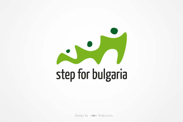
Step for Bulgaria Foundation is an organization, founded with the aim to develop projects initiated by and for young Bulgarians.
In this logo the composition is growing from small to big. That illustrates progress and dynamics. The 3 human silhouettes depict the evolution of a person and the idea of a network of people – connected and helping each other.
T-shirts.
Cyrillic adaptation.
We’ve also developed a few web design proposals. This is our first one which was eventually chosen and is now active. You can visit the foundation’s webpage here.
This was another web design project of ours.
Few other logo design proposals.
A more serious interpretation of the same concept. Stairs as a symbol of development.
Here the progress is illustrated through 2 different states of the step.
In this logo we have concentrated more on the “network” and “helping each other” associations.
The post Foundation Logo Design – Step for Bulgaria appeared first on Ralev.com - Design & Web Agency.


